Post by Admin on Sept 9, 2021 11:25:48 GMT -7
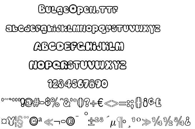
I needed a special font for a project and after searching, couldn't find anything close to my needs. BUT I did find 5 programs for MAKING FONTS! I decided to make my own, and after more research, I joined High-Logic on Monday Feb 23, 2004 6:13 am
www.high-logic.com/
forum.high-logic.com/
I got to know the owner, Erwin Denissen, very well. He lives in the Netherlands, had just graduated from college and started this business a few years earlier.
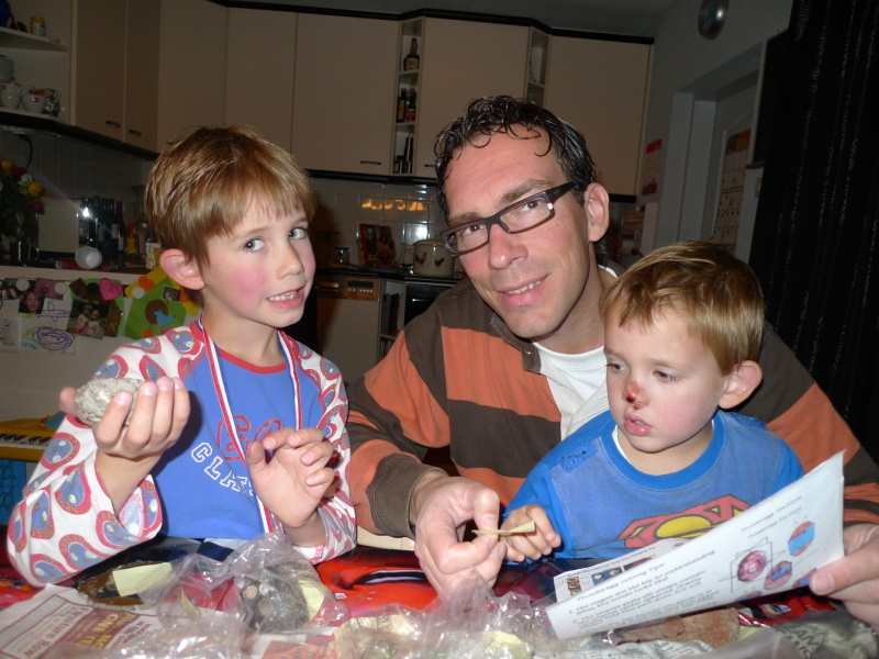
Years later after he married and had children he found out about my interest in rocks. He mentioned there were very few rocks in the Netherlands, so I sent him a box of Utah rocks and my paper on how Thundereggs are formed. He sent this photo back:
Bhikkhu Pesala (a Buddhist Monk in England) had earlier found the young company in his search to find fonts for his translations and has selflessly helped the Font Creator program improve ever since.
Here is some of my stuff:
forum.high-logic.com/viewtopic.php?f=10&t=2115&sid=efccd862ef182a284a0f7112bc6b5f92
(Bhikkhu is a Buddhist Monk in England, and one of my heroes!)
by Bhikkhu Pesala » Thu Feb 21, 2008 9:43 am
There is no need to add an ogonek to the long-tailed g, it only needs to be added to vowels. Adding accents to script fonts is quite a challenge. Almost every letter is a special case.
It helps a lot to add low profile accents to the font. Then you can have different accent designs for lowercase and uppercase. Complete Composites will use the low profile accents for uppercase and the regular accents for lowercase. Autopositioning is difficult for scripts too. Complete Composites will use autopositioning to centre accents on the base glyph with an offset for acute/grave and italics, but the optical centre is not always the same as the geometric centre, especially with script fonts.
Other glyphs, like æ or Þ need some creativity if they are going to match the font properly. Although you may never need more than a few accents, many users in Europe do require them for their daily work. Fonts without accents are next to useless for them.
Here is a very rough attempt. I haven't made much effort to design the accents to match the font, they are more suited to Garava italic than to Yolanda. The low profile accents should be designed to suit uppercase glyphs, then moved down to the same vertical position as the lowercase accents. Setting the advance width to zero and using a Capital A or E in the Comparison toolbar helps a lot with the design process.
Attachments
Yolanda2.zip
(23.15 KiB) Downloaded 270 times
My Fonts • Reviews: MainType • Font Creator •
There is no need to add an ogonek to the long-tailed g, it only needs to be added to vowels.
 Adding accents to script fonts is quite a challenge. Almost every letter is a special case.
It helps a lot to add low profile accents to the font. Then you can have different accent designs for lowercase and uppercase. Complete Composites will use the low profile accents for uppercase and the regular accents for lowercase. Autopositioning is difficult for scripts too. Complete Composites will use autopositioning to centre accents on the base glyph with an offset for acute/grave and italics, but the optical centre is not always the same as the geometric centre, especially with script fonts.
Other glyphs, like æ or Þ need some creativity if they are going to match the font properly. Although you may never need more than a few accents, many users in Europe do require them for their daily work. Fonts without accents are next to useless for them.
Here is a very rough attempt. I haven't made much effort to design the accents to match the font, they are more suited to Garava italic than to Yolanda. The low profile accents should be designed to suit uppercase glyphs, then moved down to the same vertical position as the lowercase accents. Setting the advance width to zero and using a Capital A or E in the Comparison toolbar helps a lot with the design process.
Attachments
(Download HERE!)
Yolanda2.zip
(23.15 KiB) Downloaded 270 times
My Fonts • Reviews: MainType • Font Creator •
Dave Crosby Typographer Posts: 793
Joined: Mon Feb 23, 2004 1:13 pm
Location: Enoch, Utah
"Matches" Challenge Post by Dave Crosby » Mon Nov 11, 2019 5:46 pm
I thought about creating a new "Matchstick" font, took a look at what was already out there, and was not impressed.
I started my own, but at 83 my hands are too shaky. Here are my beginnings, the challenge is to finish the font.
I started my own, but at 83 my hands are too shaky. Here are my beginnings, the challenge is to finish the font.


Dan X Solo & Tasmin
forum.high-logic.com/viewtopic.php?f=4&t=1884
Panose your Fonts:
forum.high-logic.com/viewtopic.php?f=4&t=941
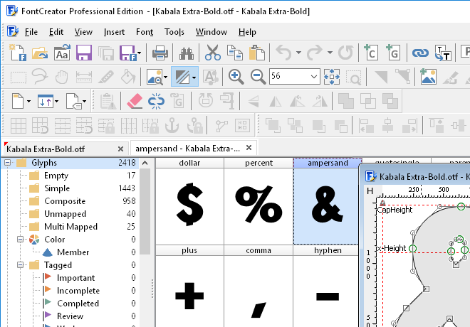
Introduction to FontCreator V7-10
forum.high-logic.com/viewtopic.php?f=4&t=4329
Font Salvage and Repair
forum.high-logic.com/viewtopic.php?f=4&t=1562
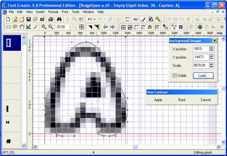
Building a New Font Using Background.
forum.high-logic.com/viewtopic.php?f=4&t=1360